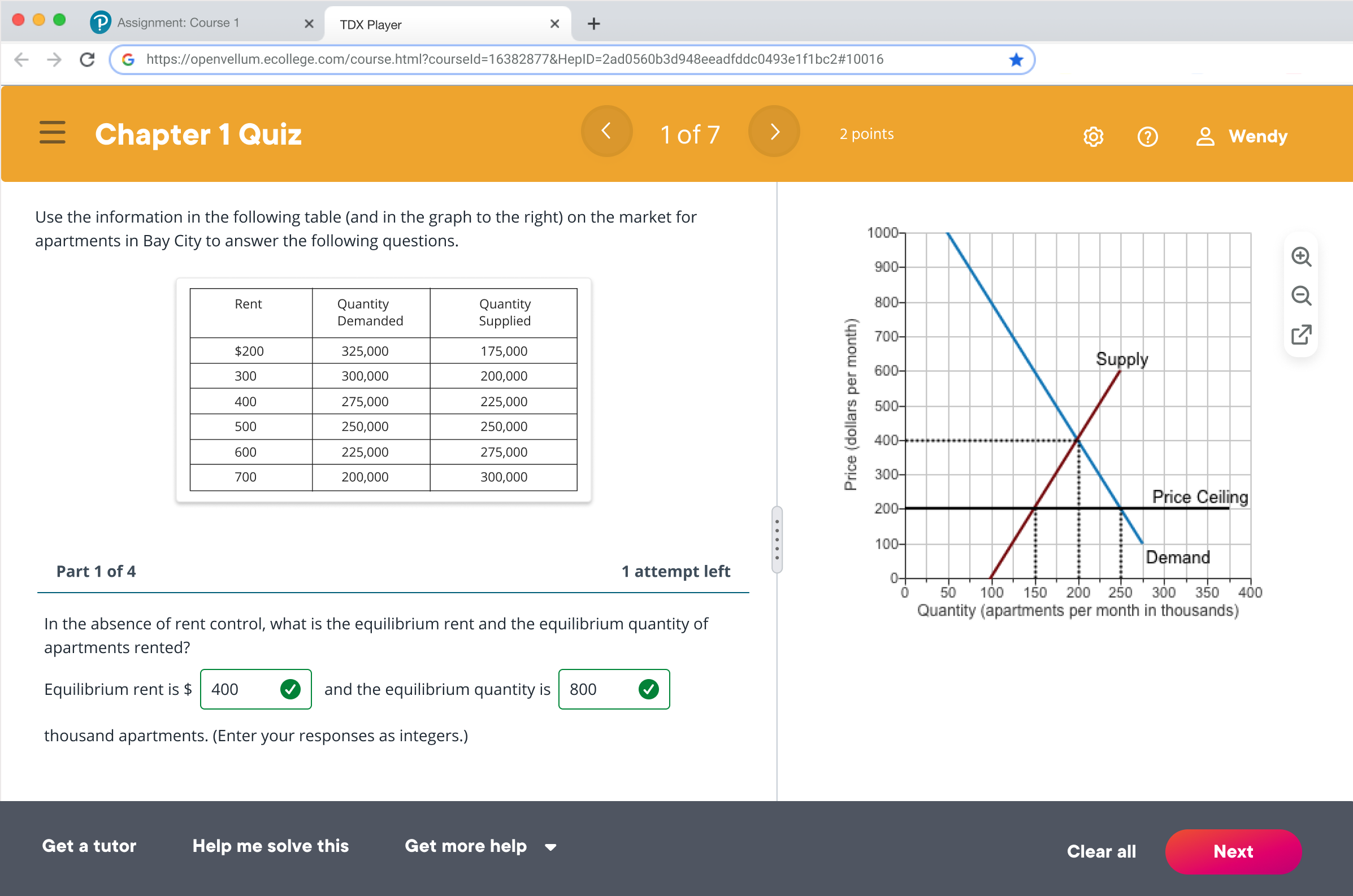
Original - TDX Player
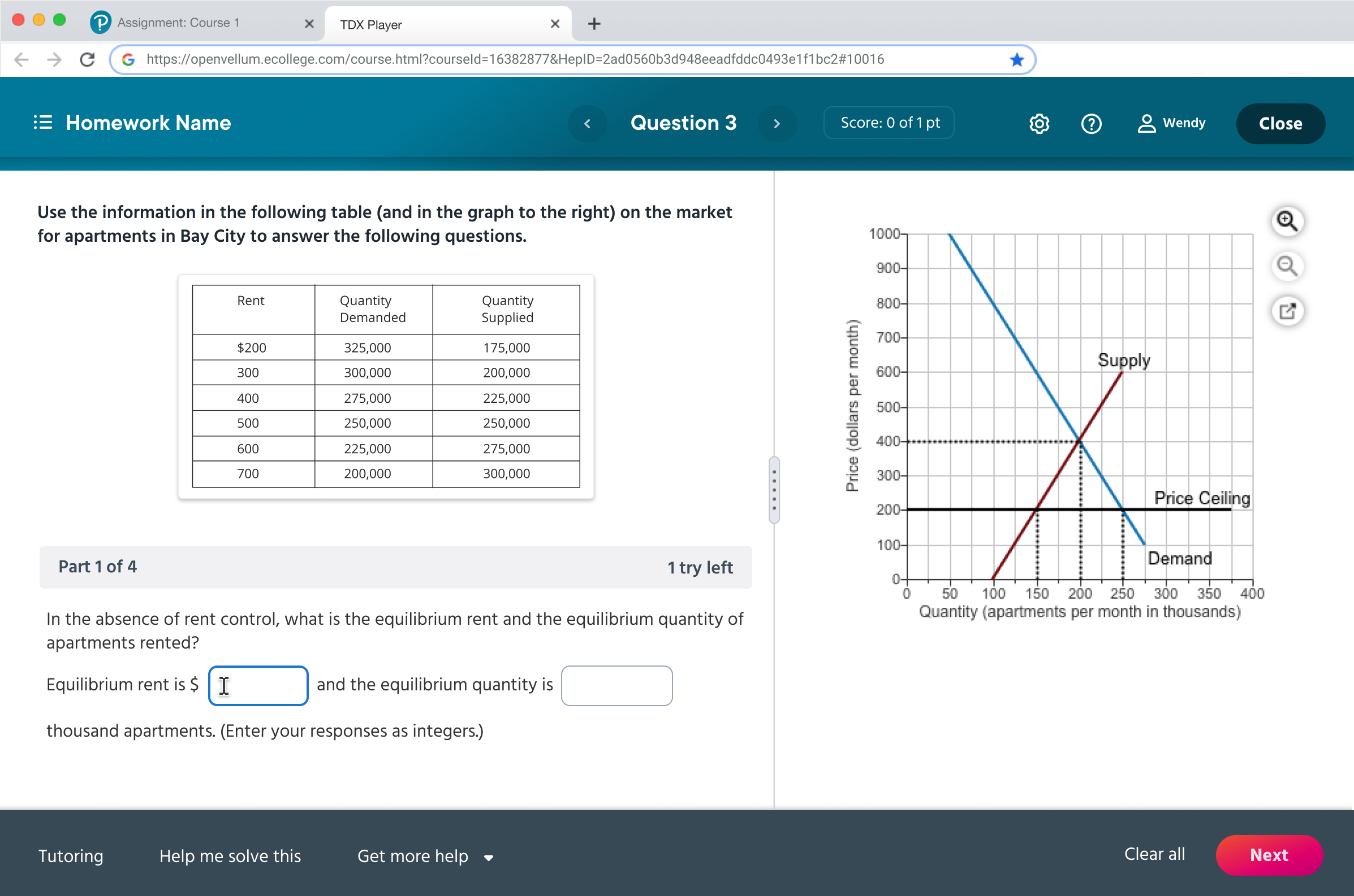
Improved - TDX Player
The Goal People who have difficulty seeing may need the background and foreground colors of text and key images to have a high contrast.
The Solution Using contract checker to make sure color combination pass the mininum contrast ratio

The Goal Around 1 in 12 boys and men, and 1 in 200 girls and women, suffer from some form of colorblindness—that’s 5% of all users. The most common forms of colorblindness mean that affected people may find it hard to distinguish between:
green and orange, red and green, blue and purple, red and brown, blue and green
The Challenge As designing for education app. Red and green are often used for correct and incorrect answer. and it is troublesome to meet the accessibility requirements.
The Solution Support color choices with patterns, icons, and text labels. In this example , I add icon as visual aid to help color blind users to differentiate between two.

Original - Pearson MyLab (Diagnostic)

Improved - Pearson MyLab (Diagnostic)
The Problem It is not efficient to use red font to indicate the “below average” number as the colorblind user will have difficult time to tell the differicences. The design need to be understandable without color
The Solution Support color choices with patterns, icons, and text labels. In this example , I add icon as visual aid to help color blind users to differenciate between two.

The Goal A label for a form control helps everyone better understand its purpose. it needs to be provided within the code to support other forms of presentation and interaction, such as for screen reader and speech input users.
The Solution Provide label and information text for each inputs. The information text should be positioned close to the inputs to help user understand its function.


